Product review: Trafic Light Food Tracker App
Written by Guest reviewer
on Thursday, 29 September 2011.
Tagged: balanced diet, healthy eating, review, technology
Guest review by Jemma O’Hanlon, Dietitian & Nutritionist
Ever wondered how effective the Traffic Light Food Label system would be? I asked dietitian and blogger Jemma O’Hanlon to review a new food label App to see if it was useful in making healthy food choices at the supermarket any easier. Here are her findings.
Jemma comments:
"After I heard that the Obesity Policy Coalition had launched their very own Traffic Light Food Tracker App, I thought I’d better check it out. Normally I feel out of the loop when new iPhone apps come out as I have its competitor, the Android, but luckily for me this App is compatible with both.
The best thing about this App is that it is user-friendly and easy to operate. To rate any food, you simply key in the figures for total fat, saturated fat, sugar and sodium (from the Per 100 g column on the nutrition information panel).
For each nutrient you are provided with a colour rating, either green (for low), amber (for medium) or red (for high).
You can also tap on each colour to find out more information about that nutrient. The App uses only one simple rule to rate foods - namely “the more green lights, the healthier the choice”.
So what criteria do they use to assess each nutrient?"
By playing with the App, I worked out that their criteria are:
|
Nutrient per 100 g |
Low (green) |
Medium (amber) |
High (red) |
| Total fat | ≤3g | 3.1g to 19.9g | ≥20g |
| Saturated fat | ≤1.5g | 1.6g to 4.9g | ≥5g |
| Sugar | ≤5g | 5.1g to 14.9g | ≥15g |
| Sodium | ≤100mg | 101mg to 599mg | ≥600mg |
Comparing the App to a dietitian’s rating
We put three healthy foods to the test on this App to see how they rated and how they compared to our own view of them.
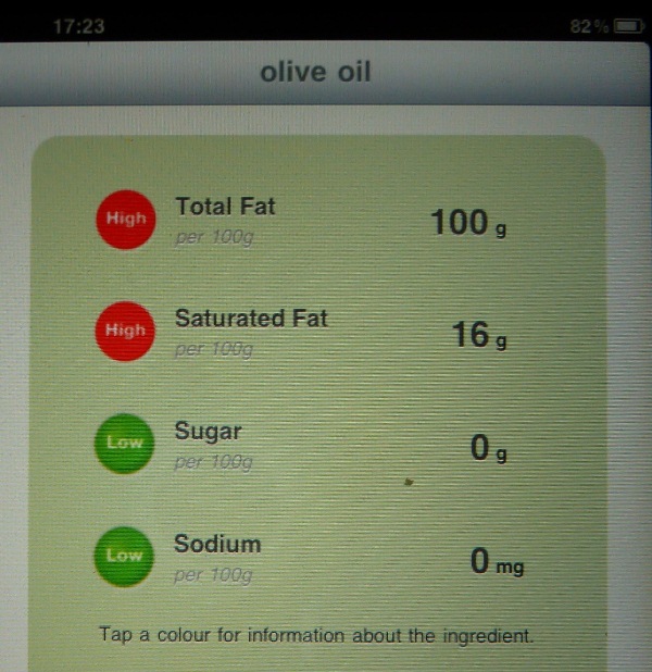 1. A lovely extra virgin olive oil from a local winery
The App: Two red lights (fat and saturated fat) and 2 green lights (sugar and sodium).
The dietitian: Olive oil is high in monounsaturated fat which is heart-protective.
Two red lights and two green lights is misleading as olive oil is high in good fats and low in the bad (saturated) ones. All oils are high in total fat so this is not a good indicator of its health benefits.
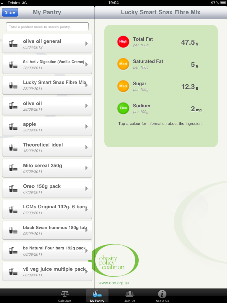 2. Lucky Smart Snax Fibre Mix (nut & seed mix)
The App: One red (fat), two amber (saturated fat) and one green (sugar and sodium).
The dietitian: An unsalted nut and seed mix is a top snack and eating a small handful a day has been linked with good weight management and heart health.
Nuts and seeds help to keep you fuller for longer and are a rich source of dietary fibre.
Like olive oil, the App provides an inaccurate assessment of this nutritious product.
3. Ski Activ Digestion Yoghurt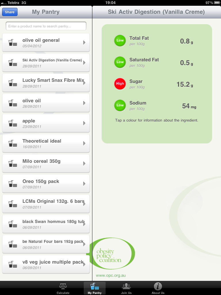
The App: Three greens (fat, saturated fat and sodium), one red (sugar)
The dietitian: Eating a tub of yoghurt a day provides us with one third of our daily calcium intake and nutrients to strengthen our bones.
Yoghurt has been known to play an important role in gut health due to the presence of good bacteria.
These health benefits far outweigh the small amount of added sugar.
Then we tested three not-so-healthy foods:
1. LCM bars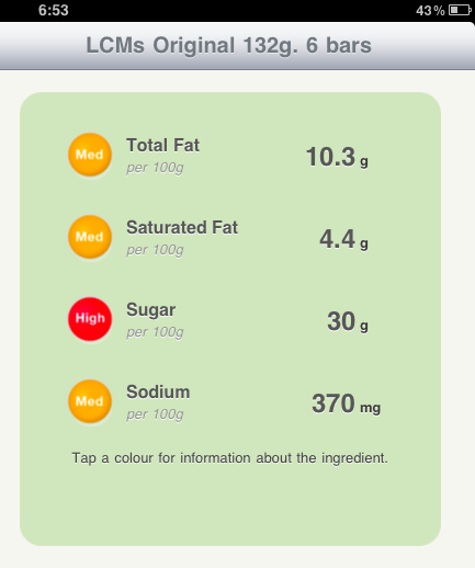
The App: One red (sugar) and three ambers (fat, sat fat and sodium)
The dietitian: LCM bars are made of refined puffed rice which gives them a high Glycemic Index and very little dietary fibre.
These snacks offer little nutritional value, yet the App shows only one red and three amber lights as there’s no rating for the quality of the carbs nor the fibre.
2. Milo cereal 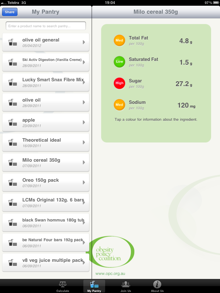
The App: One red (sugar), two ambers (total fat and sodium) and one green (sat fat)
The dietitian: This rating surprised us as – given all the hate mail this cereal receives – we would have thought it would have rated much worse.
It only scored one red thanks to its high sugar whilst being moderate (amber) in sat fat and sodium.
3. Oreo biscuits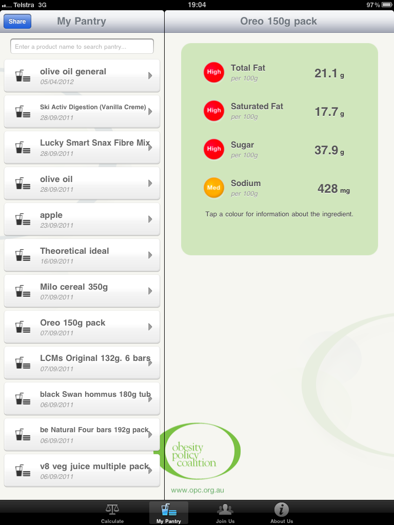
The App: Three red (fat, sat fat and sugar) and one amber (sodium)
The dietitian: With its first ingredient listed as sugar, the app correctly identifies this sweet biscuit as a poor nutritional choice.
For once, we’re in agreement. This is one of the few foods to score three reds on the App - for fat, sat fat and sugar so it would fall down on most nutrition scores. Not many foods come out as poorly as this.
My 5 criticisms
On the surface, this App looks as if it’s giving you a good guide to the amounts of nasties in products. However its sole focus on the ‘negative’ ingredients means it misses the wood for the trees.
- A simplistic set of criteria
There are a number of important food factors that this App doesn’t include, such as the total kilojoules you can consume, the portion size you eat, fibre, Glycemic Index, total carbohydrates and added sugar (not the sum of the natural sugars AND any added). Not to mention important nutrients such as vitamins or minerals that we need for health. The App compares apples with oils, using it’s one set criteria for all foods, regardless of their category. In my opinion, you can’t compare apples with bread … or oil or muesli bars or nuts. - Penalises good foods with good fats
Foods with a higher total fat content will rate poorly, even if they contain good fats i.e. mono- and polyunsaturated fats. Examples of such foods are nuts, seeds and avocado which are associated with improved cholesterol profiles and a reduced risk of heart disease. - No criteria for sugar or carbs
Healthy foods like sweetened yoghurt or muesli containing dried fruit also rate poorly under sugar, because the App doesn’t distinguish between the naturally occurring sugars (like fructose from fruit and lactose from milk) and the added sugar that provides empty kilojoules and can contribute to weight gain.
In addition, there’s no assessment for carbs that are whole grain, high fibre or low in GI. - No allowance for portion size
Every food is compared on a 100 gram basis. While this allows for a fair and equal comparison, it doesn’t let you judge foods that you consume in small quantities against foods eaten in big quantities. It’s easy to munch on a small 100 gram apple, for instance, but hard to get through 100 grams of margarine or oil. - Unusual sodium (salt) criteria or cut-off
It's hard to fathom why they choose the low figure of 100 mg not the accepted 120 mg per 100g which is the official cut-off for a low-salt food.
The final word
Can it help you eat better for health? Not really. Overall I commend the Obesity Policy Coalition for taking the initiative to develop a label reading App as a first draft. However, as we can see from the tests above, in its current form, the App misses out vital nutrition information and doesn’t tell the whole story about a food’s value. In fact in some cases, as we’ve shown, it is misleading.
Jemma is an Accredited Practising Dietitian and Accredited Nutritionist. Check out more from Jemma at jemmaohanlon.com.
You may also be interested in...
Foodwatch
The Good Stuff
The Boring Stuff
© 2025 Foodwatch Australia. All rights reserved
Website by Joomstore eCommerce


